Tab order is the DOM, read one block at a time
Your tab order isn't your visual layout. It's your DOM in source order, and Tab visits every control inside a container before it reaches anything after it.

Tab order is the sequence your focus moves in when you press the Tab key. The HTML spec has a name for it, sequential focus navigation, and an element you can reach that way is sequentially focusable.
This matters to anyone who uses your app with a keyboard, like keyboard users, screen reader users, and people using switch access or voice control. They reach one control at a time, and your page decides what comes next.
So reaching every control is the first thing you need. The order those controls arrive in is the second thing, and the second one decides whether your app can be used at all.
What decides that order?
Tab follows the DOM, not the screen
Your DOM decides it. Nothing else does.
The order is tree order, which means the order your elements are written in the document source, read from the top. The element written first receives focus first. The element written last receives it last.
That holds as long as your focusable elements have no tabindex on them, or have
tabindex="0". All of those follow source order. Now put tabindex="3" on a
button. That button leaves source order. It comes before every element set to
0. That’s why
MDN tells you
to use only 0 and -1.
Now press Tab on a normal page. Your focus looks like it moves left to right and top to bottom. That isn’t a rule. Your markup is usually written in that order, so the two match. Nothing keeps them matching. Now move an element in your source. The tab order moves with it. Whether the pixels move too depends on your CSS.
A container is a block, and Tab finishes it before it leaves
Tree order is depth first. On a page with a lot of nesting that’s hard to track, so I use one word for the unit. A container with focusable items inside it, I call a block. That isn’t a technical word and you won’t find it in the spec. It’s the word I use for this.
So here is the rule. Tab visits every focusable item inside a block before it visits anything written after that block.
Take a page with a header, a left menu and a main section. Your header has the app logo on the left, and a search box and a notification button on the right.
Press Tab. Focus goes to the logo, which is a link. (In a real app your first stop should be a skip link. Ignore that here.) Press Tab again and focus is on the search box. Press it again and focus is on the notification button.
Below the header is the left menu, with four items stacked vertically. Home, Tasks, Inbox, and Profile. Press Tab after the notification button and focus goes to Home. Then Tasks, then Inbox, then Profile.
In the header your focus moved left to right. In the menu it moved top to bottom. Why? The header is a block, so Tab visited the logo, the search box and the notification button before it left the header. Then the menu is the next block, so Tab visited its four items in the order they are written. The menu being drawn vertically makes no difference to any of this. After Profile the menu block is finished and focus moves into the main area.
One thing to be clear about. The container isn’t doing the work here, tree order is. Everything inside an element comes before whatever is written after that element. The block is there to help you read. You read your page in units instead of listing every focusable element in the document from top to bottom.
A nested control takes focus before the item below it
That menu is simple, so the rule looks obvious. Make the structure harder and the rule doesn’t change.
Give Tasks a chevron button, so the tasks under it can expand. The menu item is now two controls, the chevron and the Tasks link after it.
Focus is on Home. Press Tab and focus goes to the chevron. Press Tab again. Does focus go to Tasks, or to Inbox?
You would think Inbox. It goes to Tasks.
Inbox is the next item in the menu and it looks like the next stop. It isn’t. The chevron and Tasks are inside a container of their own. Focus is in that container now. Tab finishes that container before it leaves. Chevron, then Tasks, then Inbox.
<nav>
<a href="/home">Home</a>
<div class="menu-item">
<button type="button" aria-expanded="false" aria-label="Expand tasks">▸</button>
<a href="/tasks">Tasks</a>
</div>
<a href="/inbox">Inbox</a>
</nav>Save that to a file, open it in a browser and Tab through it. Read the source from the top and your stops are Home, the button, Tasks, Inbox. That’s your tab order. The chevron being drawn to the left of its label changes nothing here, and neither does Inbox being the next thing you see on screen.
A whole app is blocks inside blocks
Here is a fuller screen. A header, a left menu, and a main area holding four cards.
Your header has the app logo on the left. On the right there is a search field with a search button inside it, and a notification button after that.
The left menu has four rows. Home. Tasks, with a chevron button before the label. Inbox. Profile, with a sign out button after the label.
The main area is a grid of four cards. Every card has a media area with a save button on it, a few lines of text, and a More link at the bottom. On the real screen that media area holds an image. An image isn’t focusable, so it doesn’t appear anywhere below.
Here it is as markup.
<header class="app__header">
<a href="/" class="logo">GC Notes</a>
<form class="search" role="search">
<label class="visually-hidden" for="q">Search</label>
<input type="search" id="q" placeholder="Search">
<button type="submit" class="icon-btn" aria-label="Search">
<svg class="icon" viewBox="0 0 16 16" aria-hidden="true">
<path d="M11.5 7a4.5 4.5 0 1 1-9 0 4.5 4.5 0 0 1 9 0M10.2 10.2 13.5 13.5" />
</svg>
</button>
</form>
<button type="button" class="icon-btn" aria-label="Notifications">
<svg class="icon" viewBox="0 0 16 16" aria-hidden="true">
<path d="M4.5 6.5a3.5 3.5 0 0 1 7 0c0 2.5 1 4 1 4h-9s1-1.5 1-4ZM6.5 12.5a1.5 1.5 0 0 0 3 0" />
</svg>
</button>
</header>
<nav class="app__nav" aria-label="Main">
<a href="/home">Home</a>
<div class="menu-item">
<button type="button" aria-expanded="false" aria-label="Expand tasks">▸</button>
<a href="/tasks">Tasks</a>
</div>
<a href="/inbox">Inbox</a>
<div class="menu-item">
<a href="/profile">Profile</a>
<button type="button" class="icon-btn" aria-label="Sign out">
<svg class="icon" viewBox="0 0 16 16" aria-hidden="true">
<path d="M6.5 2.5H3v11h3.5M10 5.5 12.5 8 10 10.5M12.5 8H6.5" />
</svg>
</button>
</div>
</nav>
<main class="app__main">
<div class="card">
<div class="card__media">
<button type="button" class="icon-btn" aria-label="Save">
<svg class="icon" viewBox="0 0 16 16" aria-hidden="true">
<path d="M4.5 2.5h7v11l-3.5-2.5-3.5 2.5Z" />
</svg>
</button>
</div>
<p>Quarterly export finished with three warnings.</p>
<a href="/reports/1">More</a>
</div>
<!-- three more cards, same shape -->
</main>Try it
Press Tab until focus lands on the logo, then keep going. The readout underneath names each stop and counts how far through you are. Watch what happens at the chevron, and again at Profile. Narrow the window until the cards restack, then walk it again. The arrangement changes and the order doesn't.
Stop — of — · outside the app
That's the markup above, with three changes. <main> is a
div here, because a document gets one <main> and this page
already has it. The nav is labelled Demo app rather than Main, so a screen
reader on this article doesn't find a second menu called Main. And each
control carries a data-name for the readout, with a random
suffix on the input's id so two copies of this demo can't collide.
Eighteen stops, and four things in there hold more than one control.
| Block | Its stops |
|---|---|
| The search field and its button | 2 and 3 |
| The chevron and Tasks | 6 and 7 |
| Profile and sign out | 9 and 10 |
| Each card, a save button then a More link | 11 and 12, then 13 and 14, then 15 and 16, then 17 and 18 |
Now look at where the nesting starts. Not at the chevron. Stop 2 is the search field. Stop 3 is the button inside it. Focus goes into the search block and finishes it before it reaches the notification button at stop 4.
The cards are the same thing eight times. Main is a block ie. “<main>” element. Each card is a block inside main. Focus finishes card 1 completely, both of its stops, before it touches card 2. Read that markup from the top and you can write all eighteen stops down without opening a browser.
CSS moves the box, not the tab stop
Everything so far has been about where a control is written. A control is also drawn somewhere, and CSS decides that part. Here is what happens when the two places aren’t the same.
Take a toolbar with five buttons. New report, Duplicate, Filters, Export, Help. They sit in one container and they’re written in that order.
<div class="toolbar" data-block="Toolbar">
  <button type="button">New report</button>                       <!-- 1 -->
  <button type="button">Duplicate</button>                        <!-- 2 -->
  <button type="button" class="toolbar__filters">Filters</button> <!-- 3 -->
  <button type="button" class="toolbar__end">Export</button>      <!-- 4 -->
  <button type="button">Help</button>                             <!-- 5 -->
</div>
Filters is the wide one, so the design gives it a strip of its own under the other four.
.toolbar {
  position: relative;
  display: flex;
  flex-wrap: wrap;
  gap: 0.5rem;
  padding-block-end: 2.75rem;
}

.toolbar__filters {
  position: absolute;
  inset-block-end: 0.5rem;
  inset-inline: 0.5rem;
}
Nothing in the markup changed. Filters is still the third button in the container, still written between Duplicate and Export. CSS only decided where to draw it.
Look at the toolbar now. The top line is New report, Duplicate, Export, Help. Filters is underneath.
Now press Tab. Focus starts on New report. Then Duplicate. Then it drops to Filters at the bottom. Then it goes back up to Export, and then Help.
The browser isn’t getting this wrong. Tab order comes from the DOM tree. CSS paints the boxes after that, and painting doesn’t change the tree. Keeping the two in the same order has a name in WCAG, C27: DOM Order and Visual Order.
The objective of this technique is to ensure that the order of content in the source code is the same as the visual presentation of the content.
So position decides where the box is drawn. Source order decides where the tab
stop is. Both are working exactly as written, and they disagree.
Under that toolbar is a panel, which is the block model again with the numbers on this time.
<div class="panel" data-block="Panel">
  <div class="row" data-block="Chart">
    <div class="group group--stack" data-block="Axis">
      <button type="button">Range</button>       <!-- 6 -->

      <div class="group" data-block="Zoom">
        <button type="button">Zoom out</button>  <!-- 7 -->
        <button type="button">Zoom in</button>   <!-- 8 -->
      </div>
    </div>

    <div class="group" data-block="Output">
      <button type="button">Download</button>    <!-- 9 -->
    </div>
  </div>

  <div class="row" data-block="Notes">
    <div class="group" data-block="Mode">
      <button type="button">Edit</button>        <!-- 10 -->
    </div>

    <div class="group group--stack" data-block="Text">
      <div class="group" data-block="Style">
        <button type="button">Bold</button>      <!-- 11 -->
        <button type="button">Italic</button>    <!-- 12 -->
      </div>

      <button type="button">Save</button>        <!-- 13 -->
    </div>
  </div>
</div>
Focus anything in there and every block holding it is outlined. Stop 7 is Zoom out, and it sits in Zoom, inside Axis, inside Chart, inside Panel. Tab finishes Zoom at stop 8, and that finishes Axis with it. Stop 9 is Download, and that finishes Chart. Stop 10 is the first control in Notes.
Try it
Put focus on the first button and press Tab through to the last. Every block holding the control you're on is outlined while you're inside it. Watch the badges. After 2, focus drops to the bar at the bottom, then goes back up to 4.
Stop — of — · outside the demo · in nothing yet
That's the markup above, with two changes. Every button holds an empty
span for its badge, filled from the DOM order so a number can't
drift away from the structure it's sitting on. And every control carries a
data-name for the readout.
So the fix for a stop in the wrong place is never in the stylesheet. Write the control where the reader reaches it, then let CSS draw it wherever the design wants it.
Which leaves one attribute that really does change the order.
A tabindex value removes a control, leaves it, or moves it to the front
tabindex takes a number, and the number does one of three things to the
control.
A negative number takes the control out of the tab order. Tab never reaches it.
A click still focuses it, and so does focus() in your script. Any negative
number works, and -1 is the one you’ll see.
Zero leaves the control where it is. It sits in source order along with
everything that carries no tabindex at all, which is nearly every control on
the page.
A positive number takes the control out of source order and moves it to the front. Every positive value is reached before anything at zero, smallest number first.
Two controls can carry the same positive number. Source order decides between them then, and the one written first goes first.
The numbers are only used for sorting. 1, 3, 8 gives you the same order as
1, 2, 3, so the gaps buy you nothing.
Below are six panels of the same five buttons, written A to E every time. Only
the tabindex values change from one panel to the next. The last panel is this.
<button type="button" tabindex="0">A</button>
<button type="button" tabindex="1">B</button>
<button type="button" tabindex="3">C</button>
<button type="button" tabindex="8">D</button>
<button type="button" tabindex="3">E</button>
Try it
The same five buttons six times, written A to E every time. Only the tabindex values change. The badge on the right of each button is the stop it gets. Click inside a panel, then press Tab to walk that panel and check the badges against what your browser does.
Every one at zero
Source order, top to bottom. This is what you get with no tabindex at all.
Two of them at minus one
B and D are still focusable by click and by script. Tab never reaches them.
Zero and positive together
Every positive value comes first, smallest to largest. A and D wait their turn.
Zero, positive and minus one
Same three positives in the same places. D drops out and takes no stop with it.
The same positive value twice
C and E both hold 3, so source order separates them. C is written first.
Positive values with gaps
1, 3, 8 gives the order 1, 3, 3, 8 would. The size of the gap changes nothing.
Every panel is a separate document, which is the only way to show six of these at once. A positive tabindex is sorted across a whole document, so six panels sharing this page would sort into one another, and the article around them would lose its own order as well.
Look at the last panel again. A is written first and reached last. To know that,
you have to read all five values together, and nothing on A itself tells you.
The sort runs across the whole document, not this panel alone. Put
tabindex="2" on a control anywhere else on the page and every stop here moves.
The HTML spec says it in one sentence.
Developers should use caution when using values other than 0 or −1 for their tabindex attributes as this is complicated to do correctly.
So keep to 0 and -1. Use -1 when your own script does the focusing, 0
for everything else, and let the markup carry the order.
Meaning and operability decide whether your tab order is correct
So the order comes from your markup. Which order should the markup be in?
There is no single right answer, and the standard doesn’t try to give one. Success Criterion 2.4.3, Focus Order, sets a test instead.
If a web page can be navigated sequentially and the navigation sequences affect meaning or operation, focusable components receive focus in an order that preserves meaning and operability.
Meaning is whether the reader still understands the page. Operability is whether they can still use it. A form where Tab reaches the submit button before the last field fails on operability. A card where Tab reaches the More link before the text it belongs to fails on meaning.
More than one order can pass. Take a table. You can go row by row, or column by column, and WCAG says either one “may satisfy this success criterion”. So there is no single correct order to find.
Technique G59 gives the instruction.
the interactive elements such as links and form controls are placed in the content so that the default tab order follows the sequences and relationships in the content.
Placed in the content. You don’t set an order anywhere. You write each control in the place it belongs to, and the order is the result.
WAVE draws the tab order on top of the page
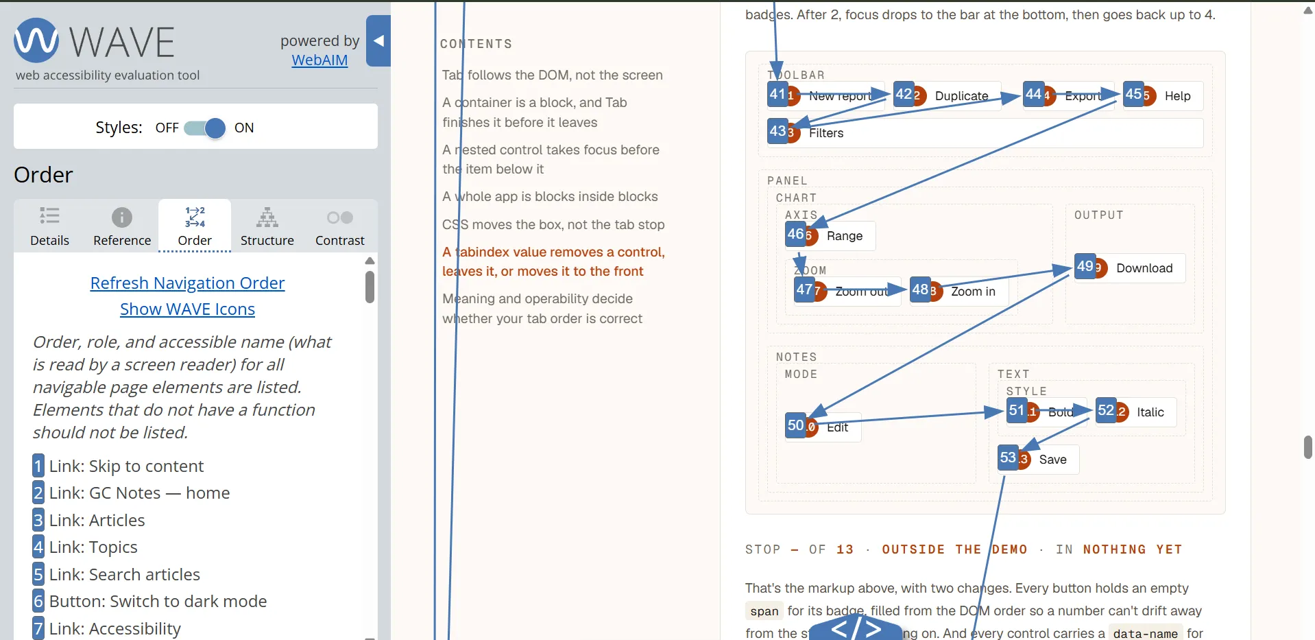
You can read the order in a browser instead of working it out from the markup. WebAIM’s WAVE extension has an Order panel. It numbers every navigable element on the page and draws the path between them. The sidebar lists each one with its role and its accessible name. The numbers run across the whole document, so the thirteen buttons in the demo above are 41 to 53 there.
The fix is always in the markup
Tab order is your DOM in source order. Read the page one block at a time and you can write the stops down without opening a browser.
CSS moves boxes and never moves a stop. tabindex does move stops, and that’s
the reason to keep to 0 and -1. So when a stop is in the wrong place, the
markup is in the wrong order. Move the control to where the reader reaches it,
and everything else follows.